


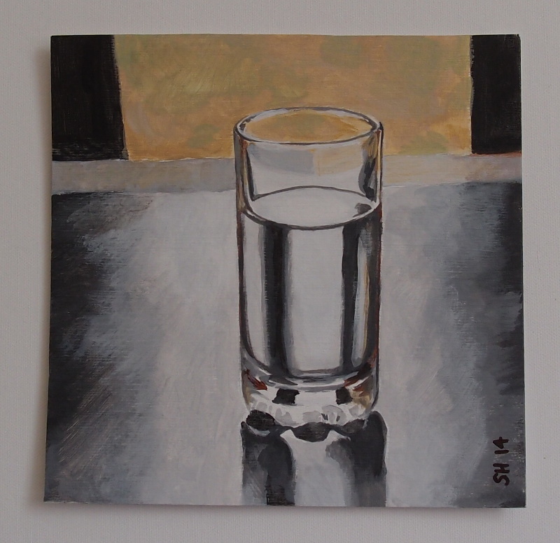
I've done another picture based on a Will Kemp tutorial: painting a glass of water. I'd not seen this exercise before but it was referred to in a lesson I downloaded, so I decided to try it before the "real" one.
First version (click for larger) is on "canvas style" oil/acrylic paper :
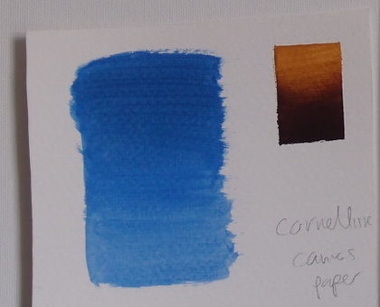
I wanted to see if I could do better blending on the table top, so this is version 2 (on 140lbs hot pressed watercolour paper) :
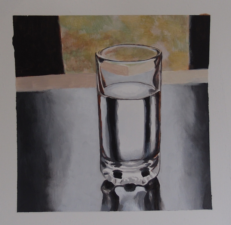
The answer was .. not really! It didn't quite work out the way I wanted, but not too bad in the end. I think I prefer version 1 though.
Right now, I'd like to try and get to grips with blending acrylic paint, something hard to do because they dry so quickly. To blend, there (really) needs to be wet paint. There seem to be various ways of dealing with this problem, including drying "retarders", more "open" acrylic paint, "glazing" mediums etc. It all gets a bit much.
So, just now I'm playing around with painting some test spheres in black and white, trying glazing medium, slow-dri blending medium and maybe other things. You don't need to do smooth blends when painting, but it is definitely one of those things I'd like to master for those times they're useful. The alternative is using oils, but that's a whole different can of worms! I think I have a high threshold tolerance for painting test spheres - we'll see.
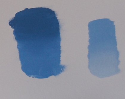
Another thing that makes a difference to blending (via drying time) is the surface you paint on. I've noticed this after trying oil/acrylic painting canvas paper, watercolour paper, canvas board and proper canvas. Some surfaces absorb the water much more quickly, which means watercolour paper might not be ideal if you want to blend (but adding a gesso surface to it helps I think).
A blend using Watercolour paper (here 140lbs/300gsm, cold-pressed but fine grain) :
That's with plenty wet paint around!
A rougher, textured canvas paper :
People demonstrating how to do acrylic blending (e.g. Youtube) often seem to show the above straight up-and-down rectangular type of example. The easiest to do! You really need to master something a bit harder e.g. spheres ...
Great North Road
By Peter F Hamilton
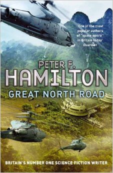
I read some Peter Hamilton books a long time ago and decided to check him out again.
I enjoyed his Commonwealth Saga series (Pandora's Star, Judas Unchained) and his Night's Dawn trilogy (The Reality Dysfunction,The Neutronium Alchemist,The Naked God). These books contain a detailed and well thought out future and some very exciting action. Pandora's Star includes a chilling and believeable alien race (with extra stress on alien).
On the negative side however, his books are extremely long, and well padded in places (tangential storylines and characters). This is also a big fault with Great North Road. The book is just far too long and not enough happens in it. The action that does occur doesn't grab you as much as it should, and happens too near the end, far too late. The rest is too pedestrian.
I haven't read his Void books but, with my reading list long, I am much less inclined to now.
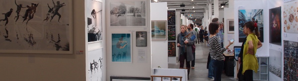
I didn't know anything about this until Friday, and was reminded about it when I was in the area on Saturday morning and saw some people queing for it outside the Old Truman Brewery ( "London's revolutionary arts and media quarter" ...) on Brick Lane. I popped over on Sunday to have a look around.
The Other Art Fair is billed as a "platform for emerging artists", and it definitely veers to the newer, contemporary and "street" side of art. That's not to say that there weren't a lot of things I liked.
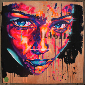
On the right, a painting from Rowan Newton, a South London artist in a "street" style. Big, colourful and pretty good.
This picture's on wood, there was another version on paper at its side (both for sale, I forget the price).
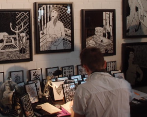
On the left, Benjamin Murphy at work. What appeared to be bold black and white brush work is actually cut out electrical tape. Looks like it must be a painstaking business putting the pictures together.
His art actually reminds me a little of Charles Burns, a comic artist. Do a Google image search to see what I mean (but warning: some weird stuff e.g. see the The New Yorker strangely enough).
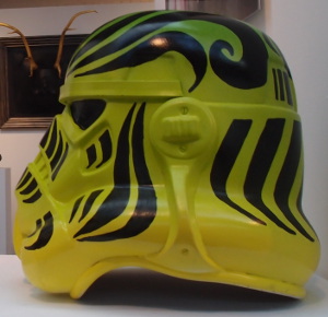
And a whole booth seemingly devoted to Star Wars Stormtrooper art. I'm sure there are plenty of people interested in this sort of thing (I've known a few).
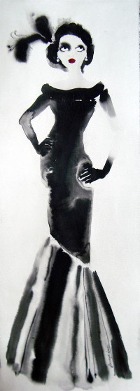
I also liked some of Bridget Davies long watercolours. Some are long as in a metre or so, but look good framed on the wall. Stylish.
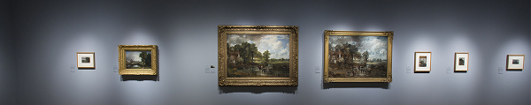
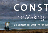
The Constable exhibition at the V&A is titled The Making of a Master and shows Constable's growth as an artist and many of his influences down the years.
A lot to see in the show, each room has a theme (common practice now) and some rooms devoted to prints he might have owned, or borrowed to copy. Many prints are "after so-and-so" (e.g. After Rubens). In those days, collecting or looking at prints was the only way one could see a lot of art, second hand. No wonder some (well off) people built special cases for a painting so they could carry it around with them wherever they went.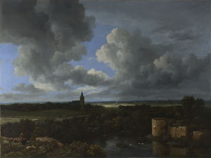
I've grown to really appreciate the 17th Century Dutch school of landscape painters, artists like Van Ruisdael : Constable learned a lot from them.
Right : A Landscape with a Ruined Castle and a Church, about 1665-70, Jacob van Ruisdael
However, he holds his own (and then some) in such august company. One of the best aspects of the exhibition is being able to stand in front of both the study and the final work. For some of his paintings, the study is large: as large as the final work. Big, momentous oil paintings, as big as Turner's, but otherwise very different.
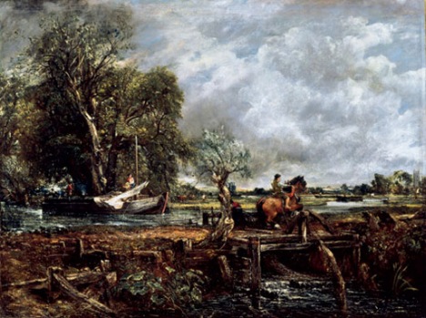
Constable's The Leaping Horse is over 6 feet long and has an equally large oil "sketch" hanging beside it.
Below : The Leaping Horse 1825
Oil on canvas
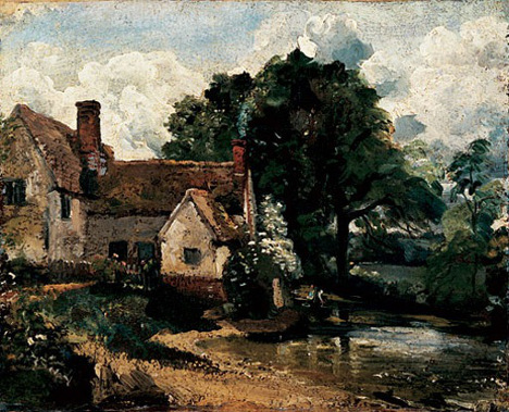
And his oil sketches stand out, one of the first artists to try and complete more of the painting out of doors, in front of the subject. As you'd expect, the weather often caused him problems, rain-drops running into the paint in some places.
Below : Willy Lott’s House 1816
Oil on paper laid on on canvas
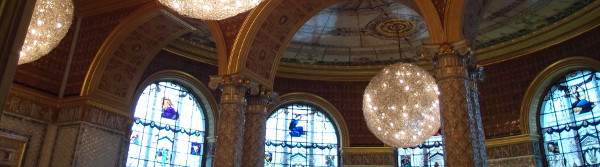
The Victoria and Albert's a good museum that I don't visit often enough. I couldn't resist some lunch in the very ornate café either!
Walking around the Tate's Late Turner show, it's hard to believe that he was painting like this so long ago. That's over 150 years ago! It's hardly surprising that so many found his work strange and hard to fathom at the time.
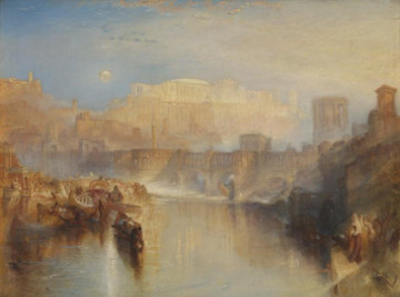
Ancient Rome; Agrippina Landing with the Ashes of
Germanicus exhibited 1839. Oil on canvas.
There are many large canvas paintings to savour here, with the trademark sweep of light and colour, quite abstract at times but always looking to capture that fleeting moment: the snow storm, the mist and fog, roaring water. Quite an amazing painter although one has to sympathise with the audience at the time, wondering what to make of it all.
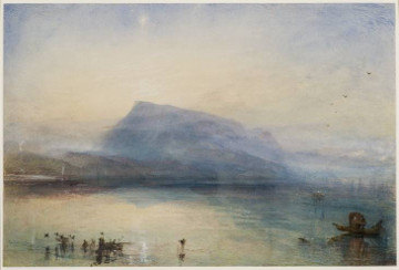
The Blue Rigi, Sunrise 1842. Watercolour on paper.
As well as the big pictures, a lot of smaller watercolours and sketches show off his virtuosity in this medium as well, not only the landscapes but the built features such castles, buildings and ruins. Some are beautifully finished and detailed, others more ghostly and atmospheric.
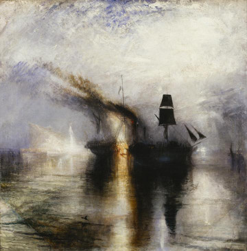
Peace - Burial at Sea exhibited 1842. Oil on canvas.
This is the first of three big exhibitions I was looking forward to. The others are Constable at the V&A, and soon the Rembrandt show at the National Gallery. The Tate's made a very good start.
I went back to the Fitzwilliam Museum in Cambridge, the second time I've been there. The last time was for an exhibition called Vermeer's Women (I blogged about it) but I didn't have time to have a proper look around the rest of the place. Now I have, I see what I missed.
The museum's been renovated recently and it shows. The rooms are bright, clean and spacious :
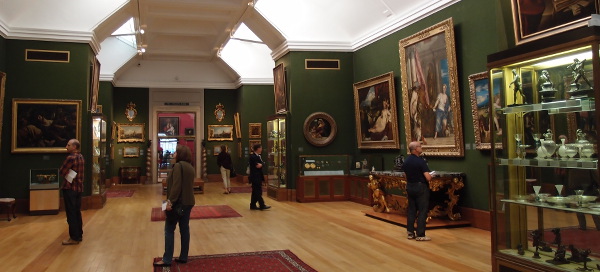
There's also a lot to see: the place is big and very ornate. A large collection of ancient world artifacts (Greece, Rome, Minoan, Persia, Egypt etc.), ceramics and pottery, as well as a lot of great art.
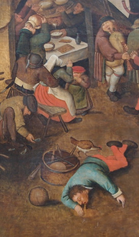
On the right: a detail from Pieter Brueguel the Younger's "Village Festival" showing how much has changed in the intervening 450 years!
The museum is a similar style to the British Museum, National Museum of Scotland, Kelvingrove and Hunterian, a big collection of lots of interesting things.
Like the other museums listed, it's free and only about 20 minutes from the station by foot.
This doesn't look like much (and it isn't!) except a very quick (under an hour), basic following of another Kemp tutorial.
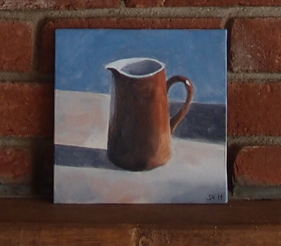
Now I don't think much of it really, quite muted and washed out, although that's partly the point. But now I place it against the brick-work wall, and think about its place in a frame (perhaps), it's not so bad. It might even look quite good in a basic frame hanging amongst other farmhouse kitchen pictures.
Rather than use a more expensive 30x20-odd cm canvas frame, I used a smaller canvas board. These cheaper boards are a little odd to paint on, the paint not adhering so well really and too easy to push around on the surface. Maybe a poor tooth to the canvas. The acrylic paint is very translucent, almost a watercolour here really.
Hampstead Garden Suburb
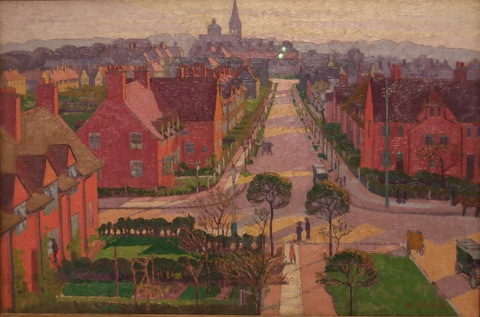
From Tate Britain, a nicely painted picture of London at the start of the last century, just before the big war. Printed beside the painting :
Philanthropist Henrietta Barnett devised Hampstead Garden Suburb, built in 1907, to provide mixed housing in pleasant surroundings in outer London.
William Radcliffe page at The Tate.
How times have changed. I wonder how "mixed" it is now, or how affordable?