


The Constable exhibition at the V&A is titled The Making of a Master and shows Constable's growth as an artist and many of his influences down the years.
A lot to see in the show, each room has a theme (common practice now) and some rooms devoted to prints he might have owned, or borrowed to copy. Many prints are "after so-and-so" (e.g. After Rubens). In those days, collecting or looking at prints was the only way one could see a lot of art, second hand. No wonder some (well off) people built special cases for a painting so they could carry it around with them wherever they went.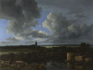
I've grown to really appreciate the 17th Century Dutch school of landscape painters, artists like Van Ruisdael : Constable learned a lot from them.
Right : A Landscape with a Ruined Castle and a Church, about 1665-70, Jacob van Ruisdael
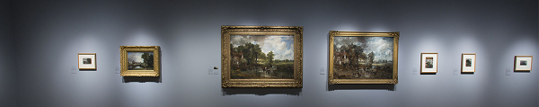
However, he holds his own (and then some) in such august company. One of the best aspects of the exhibition is being able to stand in front of both the study and the final work. For some of his paintings, the study is large: as large as the final work. Big, momentous oil paintings, as big as Turner's, but otherwise very different.
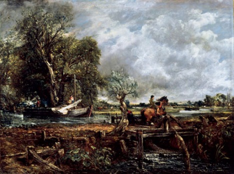
Constable's The Leaping Horse is over 6 feet long and has an equally large oil "sketch" hanging beside it.
Below : The Leaping Horse 1825
Oil on canvas
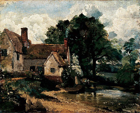
And his oil sketches stand out, one of the first artists to try and complete more of the painting out of doors, in front of the subject. As you'd expect, the weather often caused him problems, rain-drops running into the paint in some places.
Below : Willy Lott’s House 1816
Oil on paper laid on on canvas
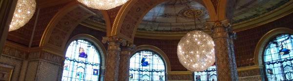
The Victoria and Albert's a good museum that I don't visit often enough. I couldn't resist some lunch in the very ornate café either!