


Red Mars
by Kim Stanley Robinson
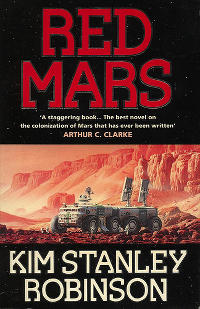
Red Mars, written by Kim Stanley Robinson in 1992, is a highly regarded novel about the human colonisation of Mars in the mid-21st Century.
It's a wonkish book in parts, analytical and scientific, and is good showing how the group of pioneering colonists (the first 100) deal with the challenges, social as well as technical. In this respect, it's a sociological study as well.
Robinson's research into the requirements of a Martian colony give the book a very believable edge. He also loves describing the planet's spectacular landscape, geography and geology, but perhaps at a slightly too great a length on occasion! Geologists may appreciate it a bit more.
The novel is much more than a science lesson though. Although some of the main characters are not very likeable, there is enough interesting discussion, and some excitement, to keep us reading. With planet Earth breaking up into war and conflict, increasing immigration to Mars and lots of tension between government and corporates, things start getting ugly.
So, hard science to a degree and sometimes the length of the discourse on the planet can drag, but I enjoyed the book quite a bit.
The political and sociological aspects of the story reminded me a little of Heinlein's The Moon is a Harsh Mistress, although Heinlein's novel is much more libertarian.
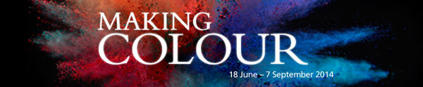
It was a toss up between the National Portrait Gallery with the BP Portrait Show or the National Gallery with Making Colour. I decided on Making Colour on Sunday, the paid show, and will check out the portraits over the week.
Making Colour is about the colour in paint pigment: where the colour comes from and how it's created and bound (such as egg yolk for egg tempera or oil for oil paint). The technology of paint changed once the industrial revolution kicked into gear, to the great benefit of artists.
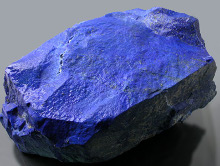
Today we generally don't care where the things we buy come from, or how they were made, but much of what we take for granted didn't exist, or was very expensive. Colours themselves were extremely expensive sometimes and paint didn't come in an easy to handle tube. For this reason, artists were as much artisans and had to learn a huge amount of technical preparation and mixing, in addition to the creative side of their work. A lot of paint pigment is ground up "rock": consider the "earth" colours like raw umber. Historically, the most expensive have been the rarest, like Lapis Lazuli, mined in far away Afghanistan, giving the rare and intense Ultramarine blue. An artist's contract would often be very specific in requiring the use of real ultramarine for the Virgin's coat.
The Wilton Diptych (below) is a very good example of the beautiful blue you can create with ultramarine. This picture was not shown in the exhibition but is one I always think of when I think of a striking blue colour. It really has to be seen in person to appreciate how intense it is.
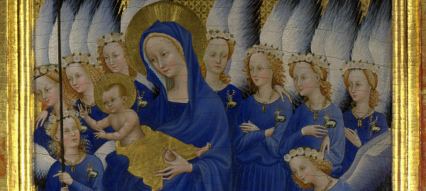 Wilton Diptych, 1395-9.
Today, Ultramarine is easily affordable and has been chemically synthesised from the early 19th Century.
Another couple of paintings that I thought worth remarking on are below, both unknown to me. The Moroni painting Portrait of a Lady is large and imposing, rather like the sitter. I loved her expression: slightly pursed, a hint of a smile. She seems a bit pleased with herself, perhaps pleased with her beautiful dress.
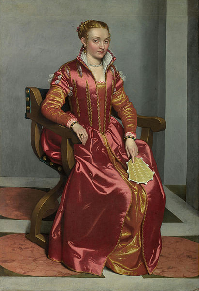
Portrait of a Lady ('La Dama in Rosso').
Giovanni Battista Moroni. 1556-60.
The full size painting is a real fashion statement. Great colour of course, and very bright.
The second painting is by Elisabeth Louise Vigée Le Brun, working in the late 18th Century in France, an exciting time to be alive (especially if you were patronised particularly by Queen Marie Antoinette. She has a straw hat on and she's working, her palette in her left hand.
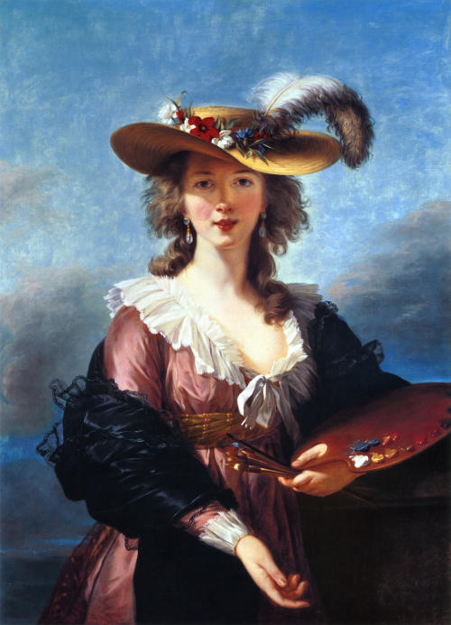
Self Portrait in a Straw Hat.
Elisabeth Louise Vigée Le Brun. 1782.
The full size painting.
I like this painting a lot. Not only a pretty face, but a nice loose, bright painting. Not formalised like a Ingres or David.
I've been down to the NPG to see the 2014 Portrait Award show now and, as usual, it is very good. There are a huge number of very good artists around today, many very technically accomplished. This show consistently has a high standard.
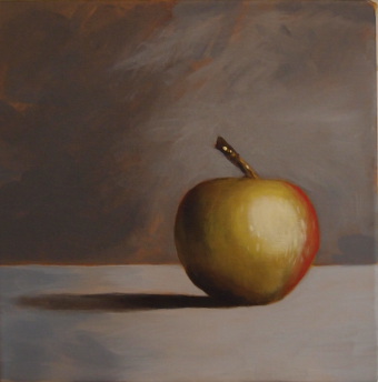
An apple. A start anyway!
This is an acrylic painting of an apple - see below for the inspiration. I've been wanting to do some painting for a while, something I used to do a lot of before being distracted with work and life. It's been a long time.
I can't say that I love the painting, or that I think it's very good, but it's not bad and I'm quite happy with it. As a first attempt anyway. I think my photograph of it leaves a little to be desired as well ...
I find acrylics much easier to deal with than oil paints, mainly due to them being water based, so no smells or complex preparation or clean-up. This makes a big difference when you don't have much space (let alone time).
Hopefully more to come. I have a lot to learn.
The inspiration for this, and the source of the above apple is Will Kemp's Art School. He not only has a great web site devoted to all aspects of painting and drawing but a huge enthusiasm. His willingness to share his knowledge and help out is absolutely wonderful (popping up all the time in the comments) - I don't know how he finds the time. Also check out his YouTube channel. I find watching people paint fascinating. A very refreshing site and a great teacher. Thanks Will!
Another recent Adobe Flash security update has me at the Adobe site again, trying to remember the update process for Linux. I use the 64 bit version and have to un-tar the archive and copy the .so to the right folder.
Adobe stopped shipping new versions of Flash for Linux a while back, but promised to keep the Linux versions updated for security (Thanks Adobe). But it's still odd seeing the different versions available for the other platforms.
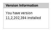
I have :
Windows, Mac and Google Chrome have :
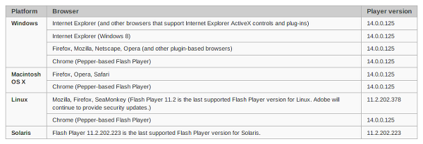
Note that the version Adobe say is the latest for Linux is wrong - 378, compared to what I just downloaded and installed - 394. Who knows? Security is hard, as is updating web pages!
Not a fan of Flash and I look forward to it disappearing. But I'm even less a fan of computer security problems, and especially the people that inflict them on us. So keep your software up to date!