


It was a toss up between the National Portrait Gallery with the BP Portrait Show or the National Gallery with Making Colour. I decided on Making Colour on Sunday, the paid show, and will check out the portraits over the week.
Making Colour is about the colour in paint pigment: where the colour comes from and how it's created and bound (such as egg yolk for egg tempera or oil for oil paint). The technology of paint changed once the industrial revolution kicked into gear, to the great benefit of artists.
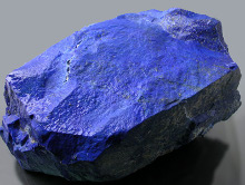
Today we generally don't care where the things we buy come from, or how they were made, but much of what we take for granted didn't exist, or was very expensive. Colours themselves were extremely expensive sometimes and paint didn't come in an easy to handle tube. For this reason, artists were as much artisans and had to learn a huge amount of technical preparation and mixing, in addition to the creative side of their work. A lot of paint pigment is ground up "rock": consider the "earth" colours like raw umber. Historically, the most expensive have been the rarest, like Lapis Lazuli, mined in far away Afghanistan, giving the rare and intense Ultramarine blue. An artist's contract would often be very specific in requiring the use of real ultramarine for the Virgin's coat.
The Wilton Diptych (below) is a very good example of the beautiful blue you can create with ultramarine. This picture was not shown in the exhibition but is one I always think of when I think of a striking blue colour. It really has to be seen in person to appreciate how intense it is.
 Wilton Diptych, 1395-9.
Today, Ultramarine is easily affordable and has been chemically synthesised from the early 19th Century.
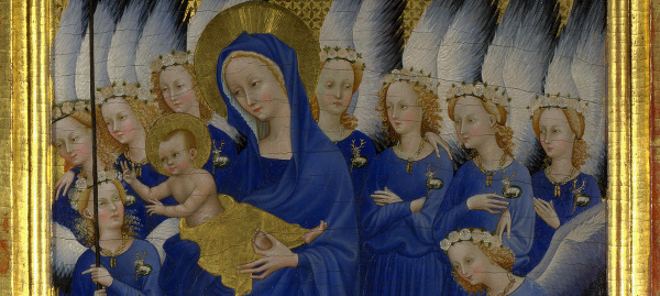
Another couple of paintings that I thought worth remarking on are below, both unknown to me. The Moroni painting Portrait of a Lady is large and imposing, rather like the sitter. I loved her expression: slightly pursed, a hint of a smile. She seems a bit pleased with herself, perhaps pleased with her beautiful dress.
Portrait of a Lady ('La Dama in Rosso').
Giovanni Battista Moroni. 1556-60.
The full size painting is a real fashion statement. Great colour of course, and very bright.
The second painting is by Elisabeth Louise Vigée Le Brun, working in the late 18th Century in France, an exciting time to be alive (especially if you were patronised particularly by Queen Marie Antoinette. She has a straw hat on and she's working, her palette in her left hand.
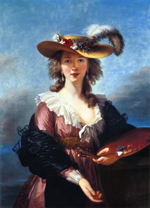
Self Portrait in a Straw Hat.
Elisabeth Louise Vigée Le Brun. 1782.
The full size painting.
I like this painting a lot. Not only a pretty face, but a nice loose, bright painting. Not formalised like a Ingres or David.
I've been down to the NPG to see the 2014 Portrait Award show now and, as usual, it is very good. There are a huge number of very good artists around today, many very technically accomplished. This show consistently has a high standard.