


This is the larger acrylic painting, completed following a recent Will Kemp tutorial video course (also see A Rough Venice a few days ago). This is the largest painting I have done, and should have been even larger. The course has a canvas at 24x24" but I used a 16x16" one, which seemed large enough to me at the time! I've been doing my painting in oils recently, so using acrylic again was a refreshing change.
Overall, I am happy with it even though I didn't really get to the end of the painting I think. I did up to the "glazing" part of the course but didn't do the palette knife work: a bit afraid I'd mess up something up that wasn't too bad at the time (I took a photograph of it before and after the glazinng anyway, just in case). I even debated stopping before the glazing work but decided to try and finish the course and I'm glad I did.
Below: Venice Sunset, acrylic, 16x16" - pre-glazing
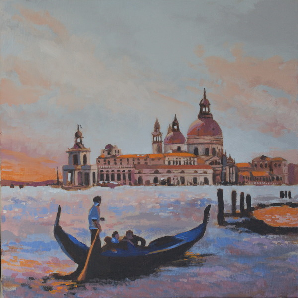
Below: Venice Sunset, acrylic, 16x16" - post-glazing

After the glazing I think I petered out at the end and then stopped. I'm slightly tempted to go back to it but I think that's it; you move on. Painting a sunset, or Venice, can also be a dangerous thing; a sunset picture can always veer into a lurid, colourful monstrosity. Hopefully not here! On to the next work ...
The painting called for some strong cadmium orange. I had some Winsor and Newton but it never stood out like the orange I saw on Kemp's video. I bought some Golden brand and it was stronger and worked better. This is not to knock W&N (good paints) but does highlight colour range per brand and how important any one particular colour can be to the overall effect.
I had another colour problem with another painting, a copy of one by a well known artist. The background blue was of a certain shade, I only had ultramarine blue and didn't think anything of it. But you discover that you cannot mix the right shade at all. Sometimes you really can't get there from here mixing colours! I found an old W&N cerulean blue which worked nicely.